These are the mostly my day-to-day activities as a first-year home student and other stuff that fascinate me.
Thursday, July 29, 2010
Form and Style in Philippine Architecture (Churches)
Manila Cathedral:
Quiapo Church:
San Sebastian Church:
Iglesia Ni Cristo Church:
The houses of worship among the Igiesia Ni Cristo (INC) are called kapilya regardless of size. This is in memory of the humble beginnings of the church and its equally humble prototypoc buildings or beginnings of the church and its equally hummble prototypic buildings or sambahan. The only one that is called templo is the one at the central office in Quezon City, alltough the San Fernado Kapilya is popularly known as Templo Central Luzon. The INC interiors are well lit and airy due to the many windows of plain glass and high ceilings. Towers and spires, decorated with openwork tracery are many. Walls featured elongated mullions with flat arches, web-like tracery, or fret in precast. The decorations are non-figurative. For Felix Manalo the Gothic style seemed ecclesiastical.
Form and Style in Philippine Architecture (Buildings)
The kapitolyo, from the Latin word "capitolium" or capitol is always referred to the building of the provincial government located in the capital town or city. The entire building or its main portion is rectangilar in plan, two to three stories in height and set on on a poduim consisting of several steps. A two-sotry portico at the center of the facade shwltered the entrance which had one or several doors. (Perez III, 1994). The munisipyo, or town hall has constructed during the American period to house government offices in the municipal level. Early munispyo are the casa real. Porticoes and vestibule are always inseparable parts of the town hall. Town halls were constructed of concrete or of wood and concrete with galvanized-iron roof. The structures that many consider to be the ultimate in kingly pride, the height or political power are built for this purpose
Wednesday, July 28, 2010
Form and Style in Philippine Architecture (Houses)
Bahay Na Bato. Also known as Bahay kastila (Spanish House), the Bahay na Bato is a residence of the well-to-do family. It has certain basic features, but the construction and design vary according to region. It is generally a two-sorry house.
Here is a description of one of the variations. "The ground floor is made of cut stone or bricks the upper floor of wood. Iron grilles protect the ground floor windows, while the second-story windows are wide with sliding pasamano (window sill), alternative windows called ventanillas (small windows), which are protected by iron grilles or wooden barandillas (balusters) reaching down to the floor, and have wooden shutters. It has a high hip roof sloping on four sides. Other are tile-roofed structures, and others are all-stones houses." (Zialcita, 1994).
An apartment is a multi-unit residence generally built in a populated urban area to be rented out to tenants. This may be row houses which is usually two-story buildings with a mezzanine. Each residential unit has living room, dining room, toilet and kitchen are in the first floor, and the bedroom is the second floor or in an elevation accessible through a flight of steps.
Tuesday, July 27, 2010
Form and Style in Philippine Sculpture
Guillermo Tolentino was the teacher of Napoleon Abueva and he made the famous Oblation statue of the University of the Philippines.
My great great grandfather, Florencio J., had his works exhibited at the 1904 St. Louis World Fair in Missouri alongside with those of Isabelo Tampinco. His bust of Jose Rizal is now in a dim corner of our house waiting to be restored and displayed. Maybe I'll do it myself when I am older.
Form and Style in Philippine Paintings
I saw this mural at the National Museum. It is called the Spoliarium by Juan Luna and it is the painting treasure of the Philippines.
Felix Resureccion Hidalgo
I think this is the other one opposite it by Felix Resureccion Hidalgo and it is being restored by conservation artists. (I need to check if this is the one when I go back there.)
Fernando Amorsolo
These paintings by Fernando Amorsolo are so dreamy and it is what I think best shows the Philippines.
but there was one done by Mr. Amorsolo which bothered me. You can also see this in the National Museum.
Carlos Botong Francisco
The stations of the cross in Don Bosco Mandaluyong were done by this great painter from Angono and I wonder if there is any effort to conserve them if they are the originals. The stations and the large mural of the crucified Christ are left exposed to the elements in the humid chapel.
There are many other great Filipino painters but I just want to focus on one who I really like. His name is Joey Velasco and sadly he died a couple of days ago. He painted this one which really bothered me.
We have been displaying Joey Velasco calendars at home for the past two years and I even gave away some for Christmas to my teachers. Too bad there won't be anymore of them.
Rest in peace Joey Velasco!
Form and Style in Art
Form is the way a work of art looks it includes everything from the material the artist uses, or the style in which the artist works, to the shapes, lines and colors in the art.
In everyday conversation style, you have style and are familiar with it. However, because it is so crucial to the understanding of art you must consider its meaning specially related to art.
Style is a characteristic of a number of characteristics that you can identify as constant, recurring or coherent. In art the sum of such characteristics is associated with a particular artist, group or culture, or with an artist's work at a specific time. For example, it can be associated with a whole artistic culture (Sung Dynasty style in China) with a particular time and place (early Renaissance style in Rome), with a group of artist whose works show similar characteristics (the Abstract Expressionist style) with one artist (Van Gogh style) or with one artist at a certain time (Picasso's Blue Period style).
Sung Dynasty's style of Painting:
Renaissance Style:
Monday, July 26, 2010
Principles of Design in Art
The principles of design are a natural part of perception. These are not rules or laws but are guidelines rather to make the most effective choices and give greater insights into the work of art. These are the principles of unity and variety, balance, emphasis, scale and proportion, rhythm and harmony.
UNITY and VARIETY
Unity is a sense of oneness of thing belonging together and making up a coherent whole.
Variety is difference which provides interest. An artist can achieve unity by holding one or two elements constant and varying the others. The artist brings together a number of diverse objects
having different colors, shapes, sizes and textures and arrange them into a pleasing composition.
BALANCE
Balance is the equality of weight attention or attraction of the various elements. Its types are symmetrical, asymmetrical and radial.
Symmetrical. balance is seen when two sides are identical and nearly so they have same visual weight.
Asymmetrical. composition has two sides that do not match. The following sets of drawing illustrate also some general precepts about asymmetrical balance called informal balance.
Friday, July 23, 2010
Vocabulary Words from Art 1 Module
Tuesday, July 20, 2010
No Pain, No Gain
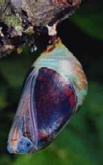
The little boy was thrilled to hear about the changes his caterpillar would go through. He watched every day, waiting for the butterfly to emerge. One day it happened, a small hole appeared in the cocoon and the butterfly started to struggle to come out.
At first the boy was excited, but soon he became concerned. The butterfly was struggling so hard to get out! It looked like it couldn’t break free! It looked desperate! It looked like it was making no progress!
The boy was so concerned he decided to help. He ran to get scissors, and then walked back (because he had learned not to run with scissors…). He snipped the cocoon to make the hole bigger and the butterfly quickly emerged!
As the butterfly came out the boy was surprised. It had a swollen body and small, shriveled wings. He continued to watch the butterfly expecting that, at any moment, the wings would dry out, enlarge and expand to support the swollen body. He knew that in time the body would shrink and the butterfly’s wings would expand.
The butterfly spent the rest of its life crawling around with a swollen body and shriveled wings.
It never was able to fly…
As the boy tried to figure out what had gone wrong his mother took him to talk to a scientist from a local college. He learned that the butterfly was SUPPOSED to struggle. In fact, the butterfly’s struggle to push its way through the tiny opening of the cocoon pushes the fluid out of its body and into its wings. Without the struggle, the butterfly would never, ever fly. The boy’s good intentions hurt the butterfly.
Art Module 1 Test
My teacher also told me that I can start using the new Philippine History book that my Papa suggested.
Monday, July 19, 2010
Texture
Optical Effects of Color
If you stare fixedly on the color areas in the illustration below for half a minute and then turn your eyes quickly to a white page of wall you will see a faint afterimage. What colors did you see?
Some colors seem to "advance" and create illusion of large size these colors are also called warm hues. They have high intensity and dark value - red, orange, yellow. Colors that seem to "recede" and create illusion of small size are cool hues. They have low intensity and light value - blue, green.
Friday, July 16, 2010
Math 1 Fractions
I will try this online lesson to prepare for my first Math test.
Thanks to the makers of this website but I still wish I would get my one-on-one tutorials with Singapore Math at Tutorlink.
Tuesday, July 13, 2010
Color Harmonies
Color harmony or sometimes called color scheme is the selective use of two or more colors in a single composition. This may be monochromatic harmony analogous harmony and complementary harmony. The artist's choice of colors is intuitive. You can only identify the color harmony of a certain work of art after it has been completed.
Monochromatic harmonies are composed of variations on the same
Properties of Color
The properties of color are hue, value and intensity.
Hue is the property of color that gives color its name. Value refers to the lightness and darkness of color. All hues have normal value. A color lighter than the hues normal value is called int, and a color darker than the hues normal value is called shade. Pink is a tint of red maroon is a shade of red. Intensity also called chroma or saturation- refers to the relative purity of a color. Colors may be pure or saturated as they appear in the color wheel. The purest colors are said to have high intensity gray colors lower intensity. Intensity gradations may be full tensity three-fourths intensity one-half intensity or one fourth intensity. To lower the intensity of a color. The artist may add a combination of black and white (gray) or may add a little of the colors complement
Monday, July 12, 2010
Color
Value
xxx
Light
Space
Sunday, July 11, 2010
Perspective
space on a two dimensional surface.
Linear perspective is the most "realistic" method of portraying two dimensions the visual depth
of the natural world. In linear perspective forms far away from the viewer seem smaller than those close up. The parallel lines receding into the distance seem to converge until they meet at a point on the horizon line where they disappear. The point is known as vanishing point. It turns the square into a trapezoid.
Isometric perspective is a system in which distant forms are made smaller but parallel lines do not converge. The lines that would be perpendicular to the picture plane are drawn as sharp diagonals. They turn the square into a parallelogram.
Atmospheric perspective forms meant to be perceived as far as the distance is blurred, indistinct, and misty-much as the eye perceives distant forms in nature.